Hi peeps!
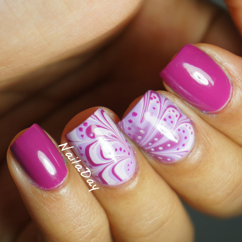
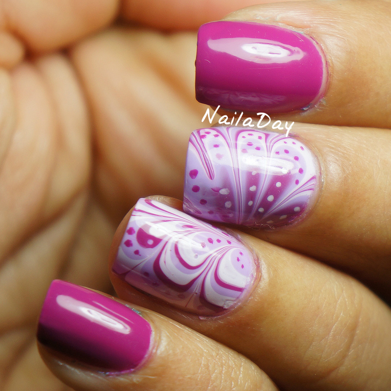
Today, I am happy to show you my first embellished watermarble design. Ever since the first time I saw this, I have wanted to try it out. I like the results of my middle finger way more than my ring but I was in a bit of a rush when I did this.
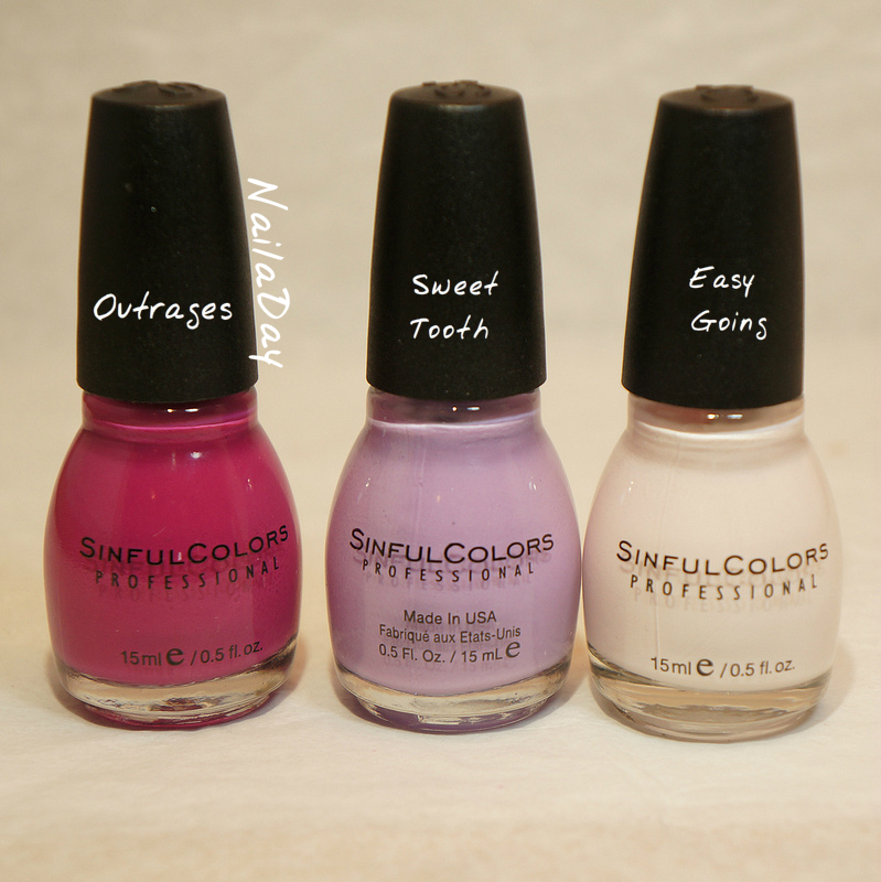
I used all Sinful Colors polishes for this watermarble. I find that all the Sinful Colors creme polishes work fairly well for watermarbling. I absolutely loved the color and consistency of the bright pink color. What isn't consistent is the spelling of the name. I swear that's how it's spelled on my bottle!
Have a good day everyone!!


so pretty
ReplyDeletebeautiful mani :)
ReplyDeleteYour mani is beautiful! It looks like a butterfly ^_^ I really like that your posts are clear and concise, but I do wish that you had a search box for easier navigation if I'm looking for something more specific (or if you do have one and I missed it maybe move it so it's easier to see.) Otherwise great work and your nail art is beautiful!
ReplyDeletesorry forgot to mention that I was part of the Blogger Bootcamp.
ReplyDeleteI'm here from WPNFF, too!
ReplyDelete- You're using Disqus, yay!
- Your layout is clean and simple, yay!
- Swap the widgets "Popular Post" and "My Blog List" - I'm here for YOUR content, not other blogger's!
- Move your social media buttons & following widgets under your "about me" widget.
Oh, Sinful Colors and their atrocious spelling! LOL. I came here from Will Paints Nails for Food feedback form. I think you have really great photos and a nice writing style. My only feedback is that your blog is quite wide on my screen, so I have to scroll left/right quite a bit. I'm now following you on your social media platforms! :)
ReplyDeleteHi there. I came from the WPNFF blogger boot camp. I love the color scheme you have with your blog. The darker background really makes your photos pop. Im viewing from my laptop and have to scroll left to right a lot to view your entire page. Maybe adjust the width a little bit so more fits on the screen? I also have to say I love the pop of color you've added with the turquoise.
ReplyDeleteHi! I'm also here from the blogger's bootcamp link over at WPNFF. I love your nails and this design, it's beautiful! Your photos are clear and show it off well.
ReplyDeleteI personally think your layout is a little cluttered, as in I get somewhat distracted from your great manicures by the number of photos and such on the sides. Maybe doing one sidebar rather than two would simplify it? Also I think your header is could be improved, it is nice that it shows your variety and skill but at the same time I think it would benefit from becoming simpler. Maybe a few of the photos aligned next to each other and the Nail A Day written over it in a single colour? It's a matter of taste of course but that's how I like it ;)
Hi, I am also here from the Will Paint Nails For Food feedback post. Firstly I have to say that your nails look incredible. I can only wish I could watermarble like that! My feedback is pretty much the same as some other ladies have already mentioned, your blog is a bit too wide for my screen and I have to scroll a little left and right. Perhaps it would work better with only one sidebar? Your photos look amazing though, and that's the most important part! :)
ReplyDeleteThis is a gorgeous marble. I love the colors you used!
ReplyDeleteThank you very much!
ReplyDelete